Disney+ Re-imagined
With the number of streaming apps available to us, more content has become readily available at our fingertips. With the common problem of streaming apps being choice paralysis, how do we solve this problem but specific to Disney+ to create the most ideal streaming experience. I took this opportunity to understand the key differences in how users use Disney+ in comparison to other streaming apps and re-imagine what the Disney+ experience could be like with a social feature.
Problem
As a competitor to Netflix, Disney+ is relatively new to the market and still has some bugs that need to be fixed. Currently, Disney+ lacks the refinement compared to its competitor Netflix. There are some minor details that Netflix has over Disney+ that make Netflix’s user experience a lot better in comparison. My goal is to add specific features that I think will help set Disney+ be in the lead of Netflix in terms of user experience. I’ve done some research on customer reviews on the overall app itself, and many pointed out the same problems or lack of specific features.
MY ROLE
UX research, product design, and UI design
WORK OVERVIEW
UX Research, UI Design
TIMELINE
4 Weeks
Competitive
Analysis
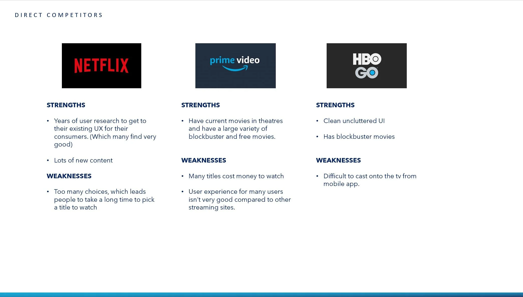
Since Disney+ is still new, it has adopted many similar patterns as Netflix to catch up to the industry standards. Another note is Disney+ users differ from Netflix and Amazon Prime users, so we can’t completely use all the similar patterns as Netflix to address a Disney+ user’s pain points.
Competitors
Platform
Most menus of competitors are very intuitive. Even if they might not have online ordering capabilities. The way they are structured allows for an easy viewing experience even if there is a large selection. Feel like you’re reading a menu from the restaurant.
Audience
The Disney+ audience can be both those who look for childhood titles as well as seeking the new titles such as Star Wars and Marvel. They also tend to watch more with family and friends rather than alone. The audience I’m mainly creating for are 15-40 year olds.
Content
The content on Disney offers both new and old titles. Although, much of Disney’s content are childhood movies that many grew up with and not new titles as often as Netflix.
Customer Reviews
Read reviews on the app store about customer’s overall experiences and many wished for technical issues to be fixed. Such as the continue watching section to not include shows they watched for a couple of seconds.
Contextual Inquiry
I asked 5 people to go through the decision process of choosing a title to watch on Disney+ to observe their decisions. While observing I also asked questions about certain decisions to understand their thought process on a deeper level.
Overview of findings: All people that I interviewed picked titles very quickly. Most, quickly went to their “continue watching” list. Otherwise, most users looked to the “New to Disney+” list to find a title. 4/5 users didn’t pay much attention to the banners at the top since most find out new arrivals to Disney+ on Social or through friends.
Findings From Interviews
Platform
Overall, the platform was very easy to use and was seamless through out multiple devices. Most user found it easy to use and easy to find what they wanted to watch..
Content
Most users found Disney+ lacked in volume of content in comparison to Netflix. Although 4/5 users are all watching the new Marvel content. Most users also didn’t find interest in watching old titles.
Choice
All users found choosing a title to watch on Disney+ super fast. Most prior to even logging into Disney+ mentioned that they already knew what to watch as soon as they logged in.
Nostalgia
During the interview, I assumed that Disney+ users would be on Disney+ to watch both new and old titles. Many had no interest until, they were reminded about childhood movies or shows that were on Disney+. Many of which happily remembered the titles eager to watch it later.
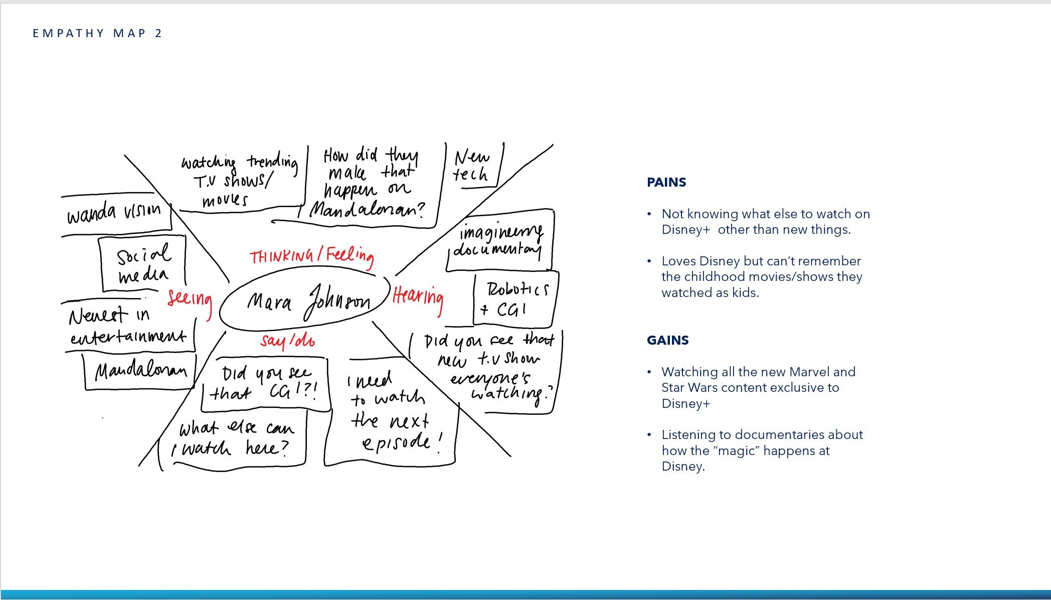

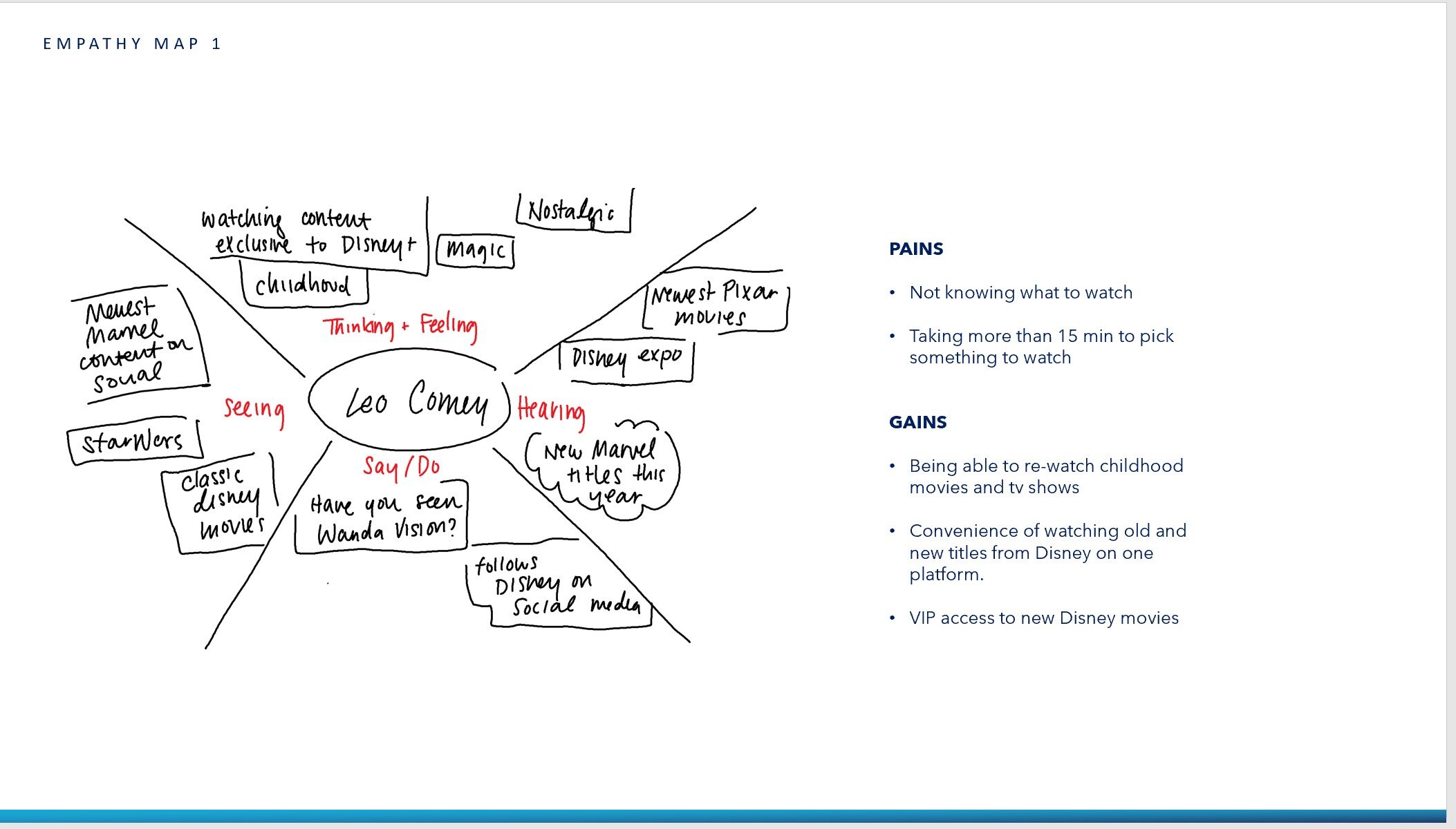
Empathy Map
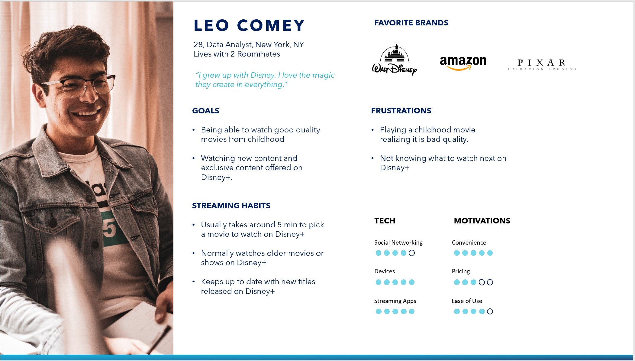
Persona
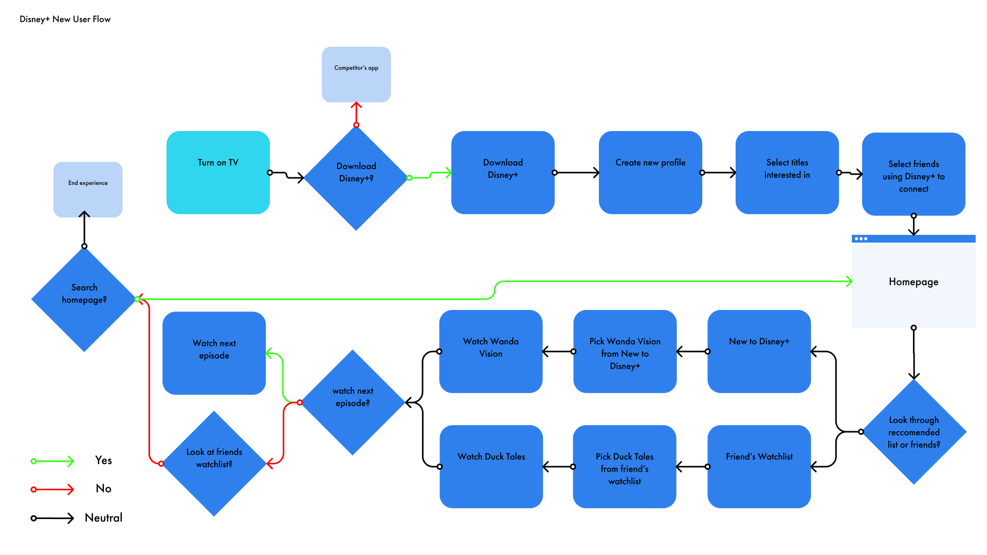
New User Flow
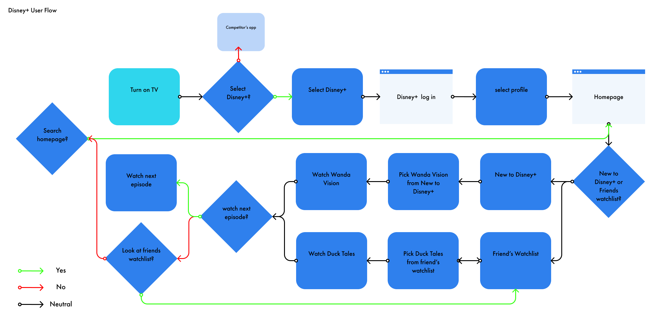
User Flow
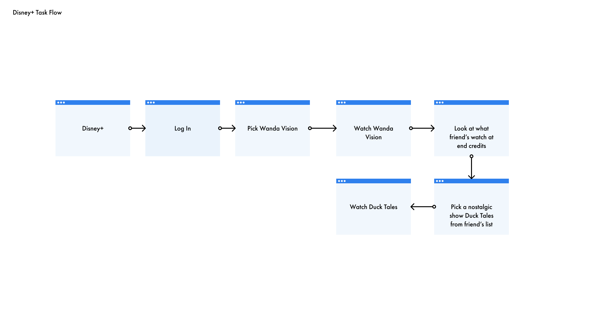
Task Flow
Interaction
Design
With wireframing, I really wanted my feature to seamlessly blend into the existing user flow. My main goal after my research was to help users know what content Disney+ has to offer by making it easier to explore. When talking to users about old shows or movies on Disney+ many said “They have that on there?” which brought to attention that the app currently relies on users to remember certain titles instead of reminding them of what they do have. By doing this, many users only stay on Disney+ for a short amount of time, usually after they finish the initial title they picked before heading over to another streaming app for entertainment.
Feature to Create Based on Research Findings
How might we help users stay on the app longer to explore more titles on Disney+ to watch instead of going to another streaming service.
Possible Solution: creating a social feature on Disney+ that allows users to see what their friends are watching to help them explore titles across Disney+.
User Flow UI Wireframes
Connect With Friends
Friend Activity
Switching Up the Homepage
Revision Details
01
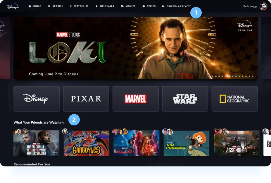
I created a tab on the menu where you can specifically see only the titles that your friends have watched recently and titles that they have liked or disliked. Here, people would be able to see what titles are trending amongst their friends and also be able to explore new titles that friends have watched.
Similarly, you can access your liked and disliked titles in your settings to edit them easily if you made a mistake in your rating.
02
From my research, I noticed many had skipped over the “Recommended For You” list that the algorithm created for their users. I decided to place the new section “What Your Friends are Watching” into that area as many mentioned they take into consideration what their friends recommend.
Title Screen
The title page had a lot of free space to add the feature to it. I decided to leverage the circles at the top to bring in a familiar pattern from Instagram to see who from your friends have watched the title you have selected.
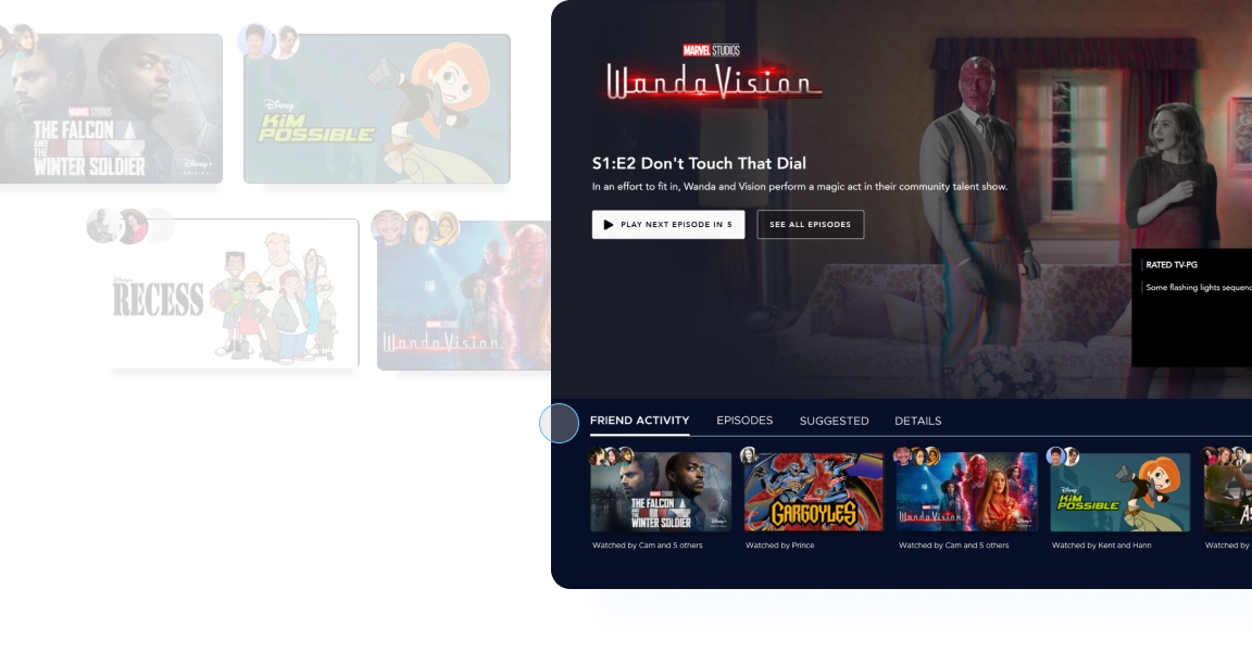
Credit Screen
At the credit screen, there was also a lot of room to add a section to choose something else to watch. Many I interviewed mentioned they felt they never knew what else to watch on Disney+ since they didn’t know what else it had to offer. This section allows you to see what your friends have watched recently to help make quick decisions as well as explore content available
on Disney+.
Mobile
Prototype
I interviewed 4 users to test a mid-fidelity prototype. I asked users to watch Wanda Vision on Disney+ and all went through the flow really easily. Some didn’t realize what had changed, and thought it was already part of Disney+ (the social aspect) while others found it very useful. One main comment that was received was wanting to see what was trending to watch similar to Netflix. Otherwise many found its nice to see what friends were watching and thought it helped them discover new titles across Disney+ as 3/4 users chose a different title to watch after Wanda Vision.
Final Thoughts
I think gaining an understanding of how Disney+ users use the app in comparison to Netflix was very insightful in understanding how this streaming app can be improved. I assumed it would be similar to Netflix, but to my surprise, the lack of choice paralysis was very interesting on Disney+. Discovering the actual problem of users not knowing what was available to watch on Disney+ created a different perspective on how the experience can be improved on the
Disney+ app.
DISNEY+ RE-IMAGINED - 2021


