


Spoilers App: Helping people reduce their food waste by inspiring them with recipes they can create.
Project Overview
PROBLEM
Have you ever felt like you didn’t know what to cook? Or maybe you’re throwing out food that has gone bad, way too often? You’re not alone. Food waste in the U.S alone is around 108 billion pounds of food per year! How can we help address this problem?
OUTCOME
To address this problem, I designed a mobile app to help remind users of what food they have in their fridge and what is expiring soon. The app then shows users what recipes they can make in their fridge.
MY ROLE
UX research, product design, and UI design
WORK OVERVIEW
App design and branding
TIMELINE
4 Weeks
How might we question
“How might we help users use the ingredients in their fridge to help reduce the amount of food wasted in the U.S?”

GROCERY LIST
Users can quickly create grocery lists to help them from forgetting what to get at the store.

EXPIRING FOOD
This feature generates recipes a user can make based off of what is in their current fridge and what needs to be used soon.

RECIPES
The recipes will let users know exactly what they are missing and how long a recipe will take.

FOOD LIST
This features allows users to see what is in their fridge at a glance. Also allowing them to see what food is expiring soon.
Competitive
Analysis
From a business standpoint, I have yet to see an app to be able to see what is currently in your fridge/ pantry to help remind you to use these foods before they expiring by providing recipes.
Most apps I saw helped users create grocery lists on their phones or create recipes by filling out what food they currently have at their disposal. From here, I hope to analyze what these apps do well and see what customers are saying about them to understand what can be improved from a user’s perspective.
Competitors


Features
What direct competitors currently have is a great start-up system, where users can click all the food, they currently have in their pantry to get recipes they can create. Although some don’t have the best organization of all the variety of food a user can pick.
Food Choices
For most competitors, they either lack the types of food available in their system or many have complained that the system simplifies the food they input and isn’t specific enough.
Look + Feel
Most have a standard look and aren’t as branded. One app called “ekilu” has the best UI although lacks in the amount of food choices. Others just don’t feel as cohesive and simple to use because of the outdated UI they have.
Customer Reviews
Super Cook currently has the most amount of users and reviews. With over 12k reviews and standing at a 4.8 star rating. One problem users were having was their pantry deleted or favorited recipes deleted meaning users had to start over which took up a lot of time. What we learned from their reviews is most users did not mind the initial start time it took to set up the app (in fact, many enjoyed the process and found it easy) but, starting over was really frustrating for them.
Research Findings
Survey Findings
With the surveys, I wanted to know what people were struggling with the most when it comes to cooking at home. Most people struggled with time and ingredients. Many want to cook at home but a lot of the time don’t have the right ingredients in the fridge or don’t have time to try out new recipes.
Although I found no correlation to people who plan out meals and make lists to the grocery store, throwing out less food that has spoiled. Even some that made lists for the grocery with planned meals threw out food often.
Interview Findings
With 1:1 interviews I wanted to dig deeper into understanding food and cooking habits people have. Interviewing 5 people, the main thing I found out was people don’t remember what food they have or they got too much of one ingredient and they didn’t know what to do with the rest. Most of the users want to cook more at home and explore recipes, but found it hard to figure out what to use the left-over ingredients for prior to the food going bad.
Some users also mentioned going to the grocery without a list and admitting that lead to buying ingredients they may have already. While one user mentioned it was hard shopping with a list because they have their hands too full.

Second Survey
With my second survey, I did a quick one to understand what people find as an easy experience when creating lists since this app will have many. I found 53% of people like choosing from premade lists and 33% want to scan in a barcode. Another insight I found was people keep their fridge/ pantry tidy so they can quickly see what they have to 1. waste less food and 2. not buy multiples of food on accident.
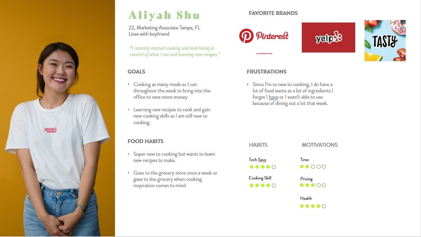
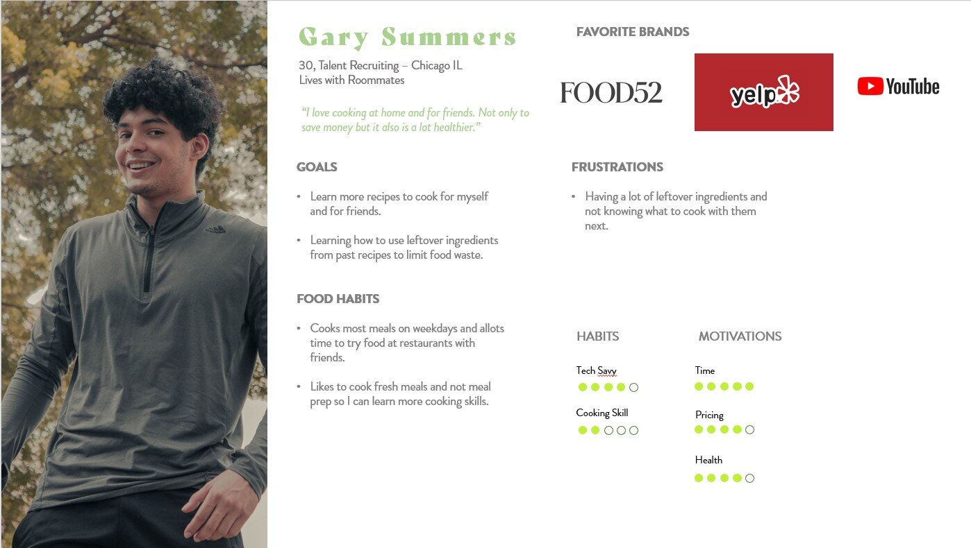
Persona
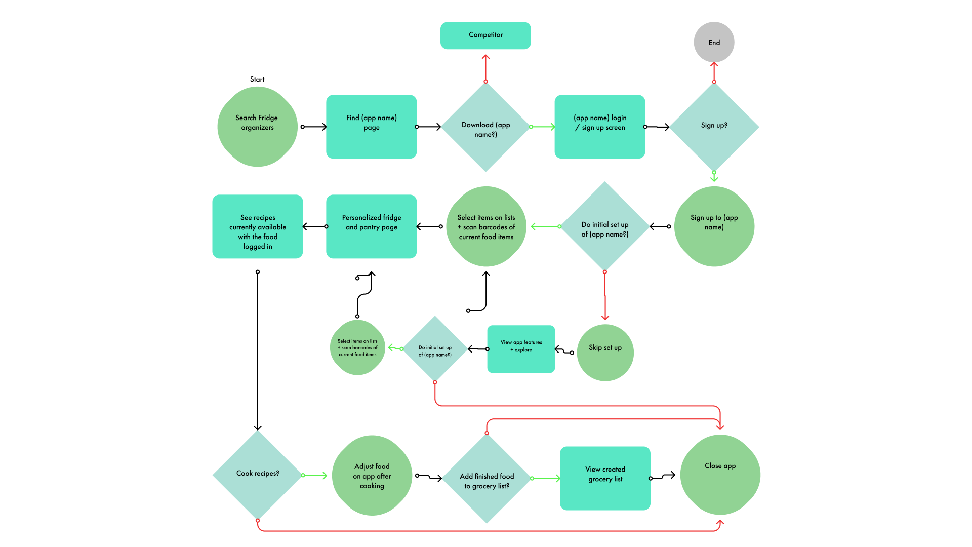
New User Flow
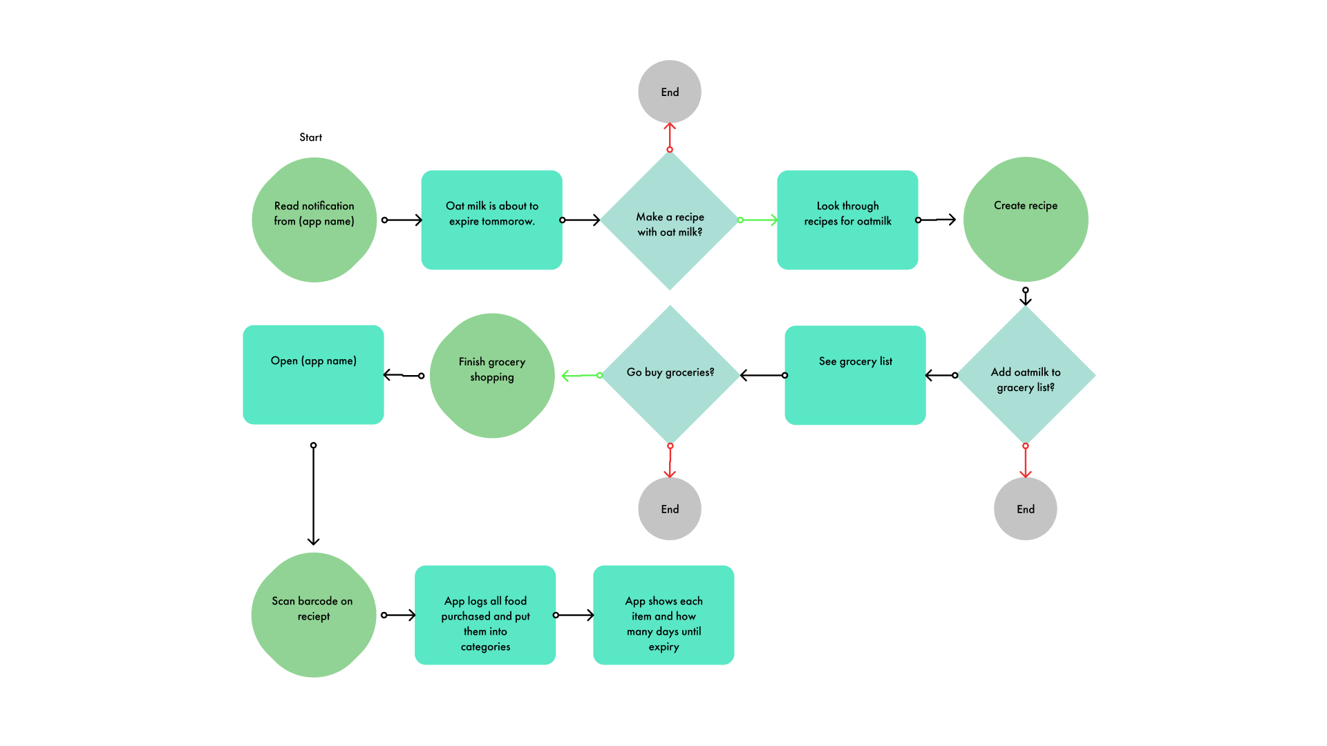
Returning User Flow
Interaction
Design
Prior to developing wireframes, I read through my research to undersatnd what kind of features should this app have. Many mentioned wanting to have a quick glance at their food to understand what they can cook and having a list to avoid buying duplicates of a certain food. Another thing I found to be important was showing how much time was needed for a recipe as many users expressed not having enough time.
Food Tracker

Recipe List

Grocery List

Profile Page

Login Screens

Features

Expiring Soon Tab
One of the main use cases of the app is inspiring users what they can cook with specific ingredients depending on what they have. This tab shows you food that is expiring soon (within 5 days) and what you can cook to use it up.

Food Tracker
The other main use case for this app is to allow users to see what is in their fridge/ pantry at a glance. It helps users know what they may need to get at the grocery or simply remind them they have food at home to cook. The categories also only appear once a user adds an item for the category for a more clutter-free space.

Recipe Page
This page allows users to look through recipes all over the internet. This page shows the main information on recipes that users wanted to know based on research and they can view the entire recipe which links them to the website the recipe is hosted on.
UI
Design
What was important to me here was creating a style that felt both fresh and appetizing while also not distracting for the user. The amount of information on this app is pretty heavy so, having a simpler design I felt would make this app feel like a clean space. Much like how users wanted their fridge to look.
The biggest hurdle here was creating a color palette that can showcase the colors red and green to help symbolize fresh vs expiring. I landed on creating a gradient to avoid clashing colors with the brighter greens and reds while also complementing the hues of orange.


Moodboard
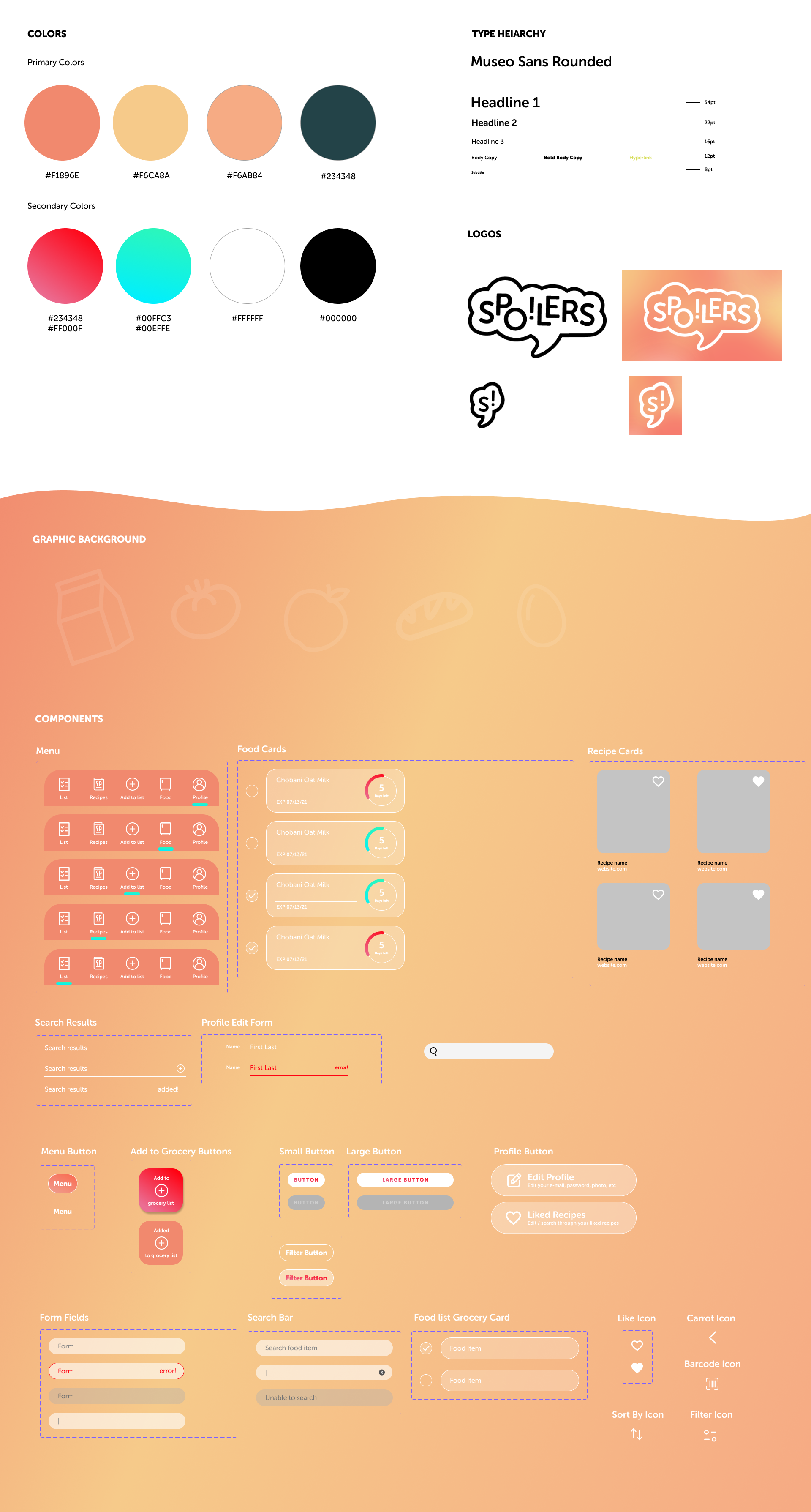
UI Kit
Mobile
Prototype
After creating my first prototype, I tested the app with potential users and found that this portion of the project was the biggest turning point in terms of research. Seeing how users interacted with the prototype made me see some more patterns that users were expecting that weren’t addressed in interviews or surveys.
Since timing was so short, I made revisions to the app based on what would make the biggest impact in the overall app experience.
Iterations

Expiring food recipes
The old tab showed recipes for multiple items that were expiring. I found during my scenarios users were tapping on the food item expecting something to happen. So I wanted to have this page come up once a user taps on a food item to receive recipes they can cook. I separated it into two sections: To show recipes a user can make right away, or inspiration recipes users can make if they are missing a few ingredients.

Expiring soon tab
Prior to this, I found many users feeling confused when clicking on this tab since the page felt inconsistent to the “All food” tab. Instead, the expiring soon tab will quickly filter out food that is 5 days from expiring for users to see at a glance.
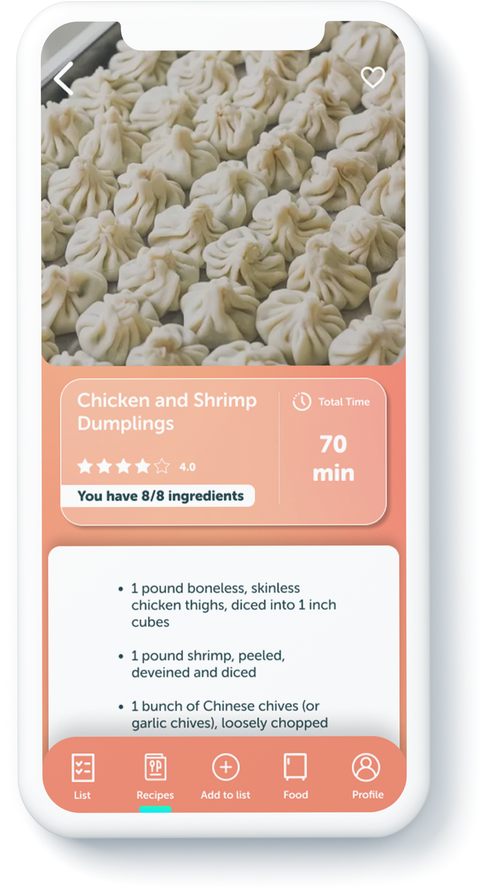
Recipe page
Although this page did test well and most users found all the information useful, I felt a need to collect more information with a better hierarchy. I found lots of users appreciated the “8/8 ingredients” and wanted that to stand out more. One also wanted to see a rating system for recipes.
Final Thoughts
This project made me learn a lot about research. In the beginning of this project my research focused heavily on if this idea would be something that users needed. I think focusing on that lead me to realize later that I had many questions about how the app should work. In the future I’d love to do more testing on wireframes over surveys to get a better understanding of how users expect an app experience to be.
Next Steps
Since the timing for this project was short, I would love to keep iterating and creating a better overall experience, especially with the feedback given from prototype testing. Especially giving more thought to how people track amounts left of a specific item or how to tell the app something is opened or unopened. There is a lot to dig deeper for this app that I feel would be so useful in creating a great experience.
SPOILERS - APP DESIGN - 2021