


Yea’s Wok Responsive Design: Re-creating a restaurant’s online experience in response to the pandemic.
Project Overview
PROBLEM
Many users were finding it difficult to navigate Yea’s Wok’s website to order their favourite dishes, especially during the pandemic.
OUTCOME
I created a responsive website for Yea’s Wok to help their customers have an easier online ordering experience that allows them to order their favorite dishes easily.
MY ROLE
UX research, product design, and UI design
WORK OVERVIEW
Responsive web design and branding
TIMELINE
4 Weeks

CURRENT SITE
REVISED SITE
How might we question
“How might we help customers easily order online to help Yea’s Wok fulfill more orders during the pandemic?”


Competitive
Analysis
Prior to conducting user research, I did a competitive analysis with other local Chinese restaurants in Seattle, WA to see what the current standard was and design patterns others were using.
I chose to research 3 family-style Chinese restaurants similar to Yea’s Wok to understand the standard for direct competitor restaurants. Then I researched 2 higher-end restaurants to understand what we can add to Yea’s Wok to elevate their experience to stand out from their direct competitors.
Competitors


Menus
Most menus of competitors are very intuitive. Even if they might not have online ordering capabilities. The way they are structured allows for an easy viewing experience even if there is a large selection. Feel like you’re reading a menu from
the restaurant.
Branding
Most competitors have a pretty clear brand. The better ones have great websites that are easy to understand and speak to the quality of
the restaurant.
Food
Upon reading reviews of the food, most of these places are rated high on Yelp! Seeing as most of these competitors have such high rating on food, customer service and experience online will speak volumes to help a restaurant stand out even more.
Online Orders
Most competitors rely on third party apps for orders. Having an online ordering section may increase business sales since not many
provide that.
User Interviews
I conducted 1:1 interviews with current Yea’s Wok customers as well as a survey to find patterns and behaviors in ordering food during the pandemic.

Findings From Interviews
Method of Ordering
Don’t worry about sounding professional. Sound like you. There are over 1.5 billion websites out there, but your story is what’s going to separate this one from the rest. If you read the words back and don’t hear your own voice in your head, that’s a good sign you still have more work to do.
Online Ordering
The majority of people talk about very efficient and convenient websites = a good seamless ordering experience. Many people have talked about worrying about the status of their food when making online orders. Also many addressed feeling irritated when they need to always put in their card info for payment every time.
Menu Viewing
There is a huge importance in easily navigating through menus (Having good descriptors and images make it better) . About 56% of people enjoy large menus and 26% of those people mentioned it’s only good if its organized well and easy to navigate. While 30% of people found large menus overwhelming, and 9% of people questioned the quality of food with
large menus.
Packaging
67% of people expect their packages to be neatly packed to avoid spillage. While 55% of those people expect their packaging to be packed neatly as they find that’s how they know its clean and safe to eat. 18% of people also mentioned wanting sustainable packaging.
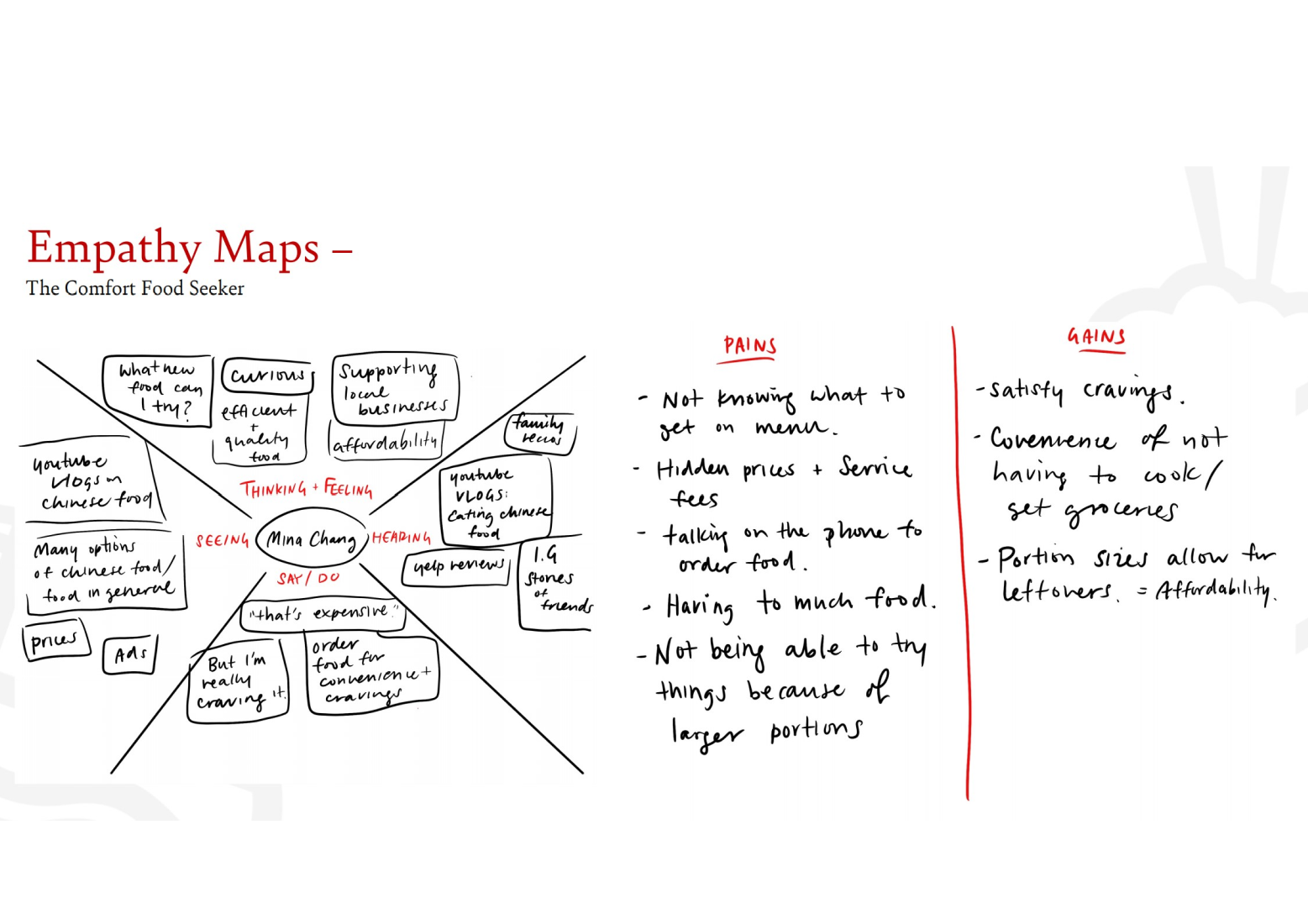
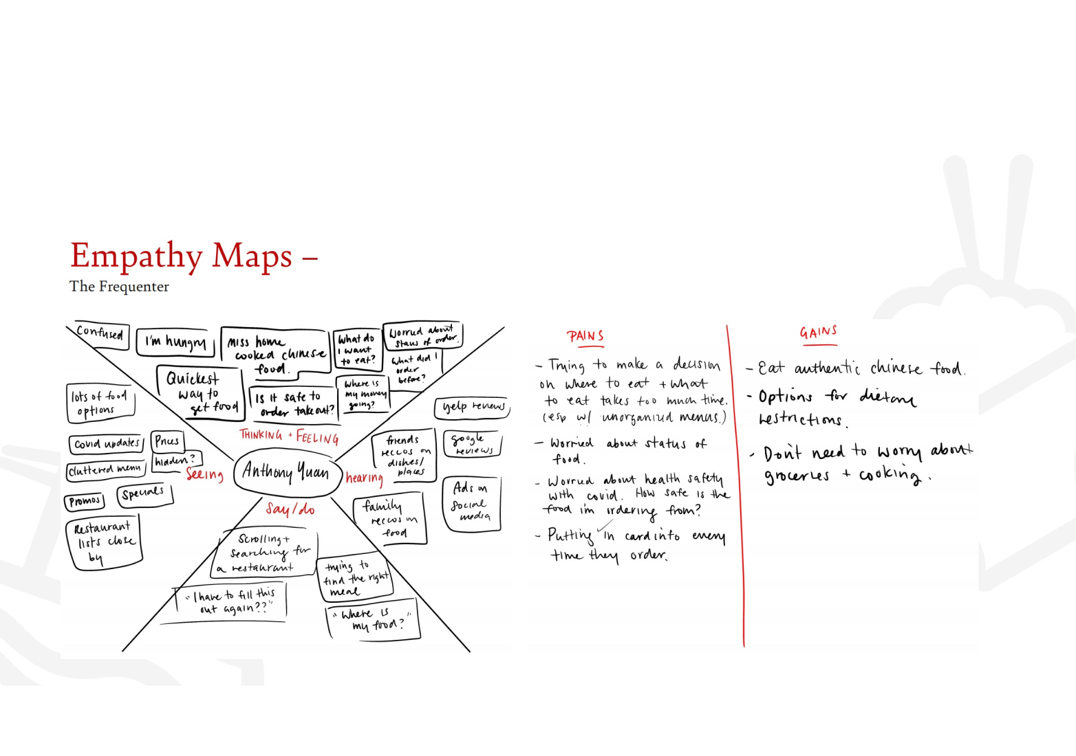
Empathy Map
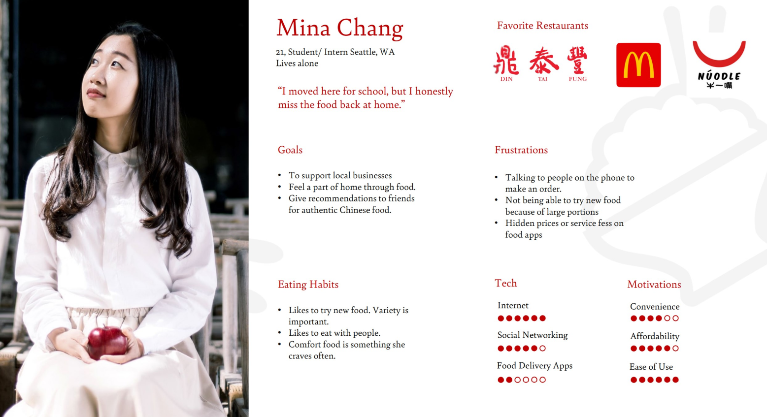
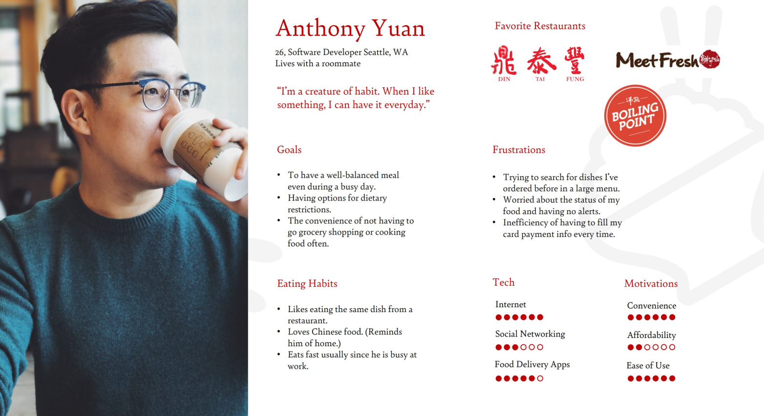
Persona
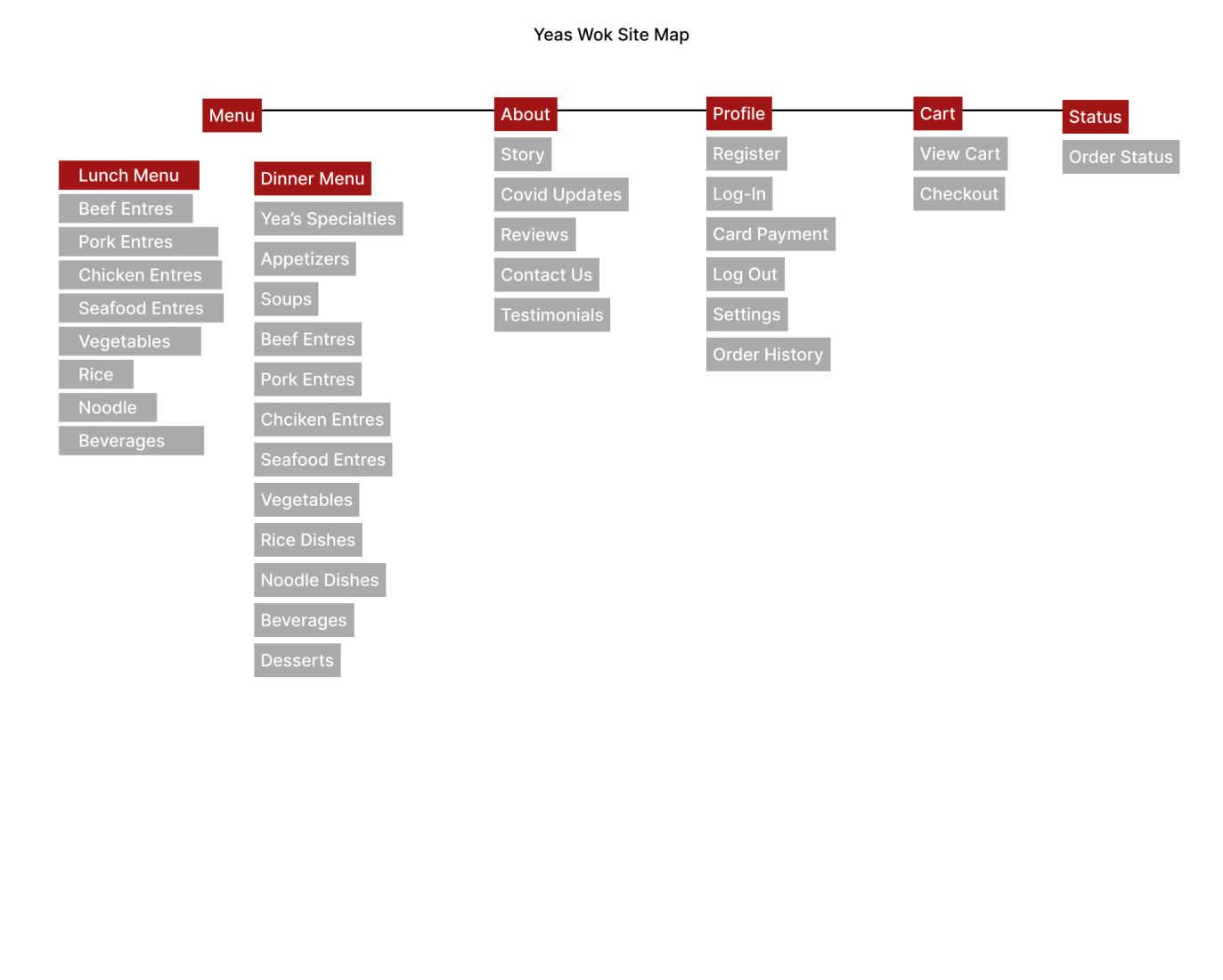
Site Map
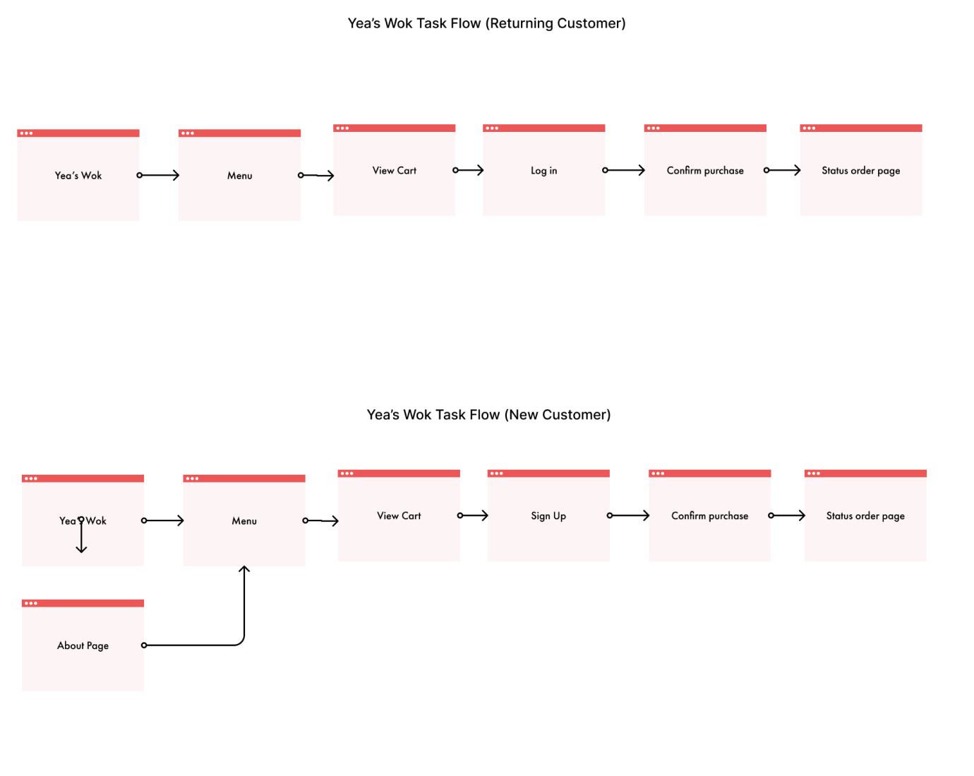
Task Flow
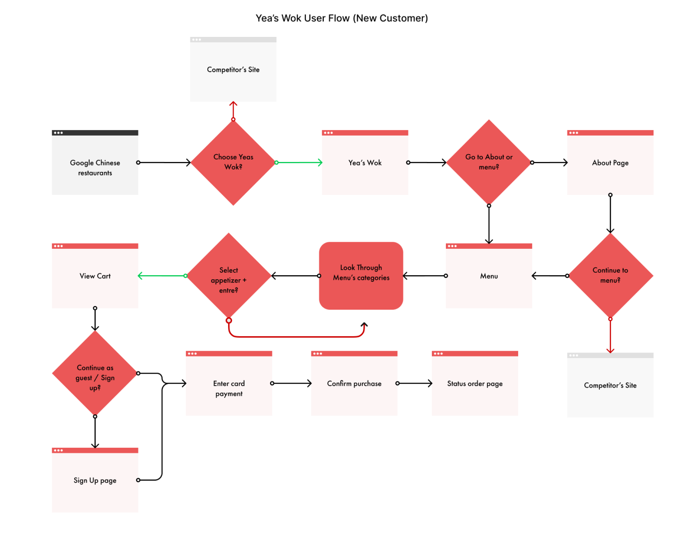
New User Flow
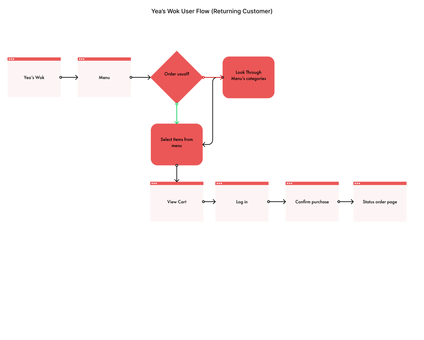
Returning User Flow
Interaction
Design
After research, I focused heavily on the mobile design as many people during interviews used their mobile devices for food ordering. While conducting research, many expressed the difficulty of navigating through their current menu. So making sure I focused on creating an intuitive menu was a priority.
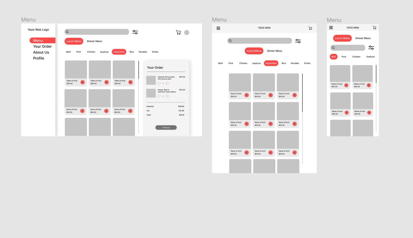
Mobile Wireframes

Desktop Wireframes

Tablet Wireframes


Current Site
The overall site felt outdated and no clear branding to set them apart from
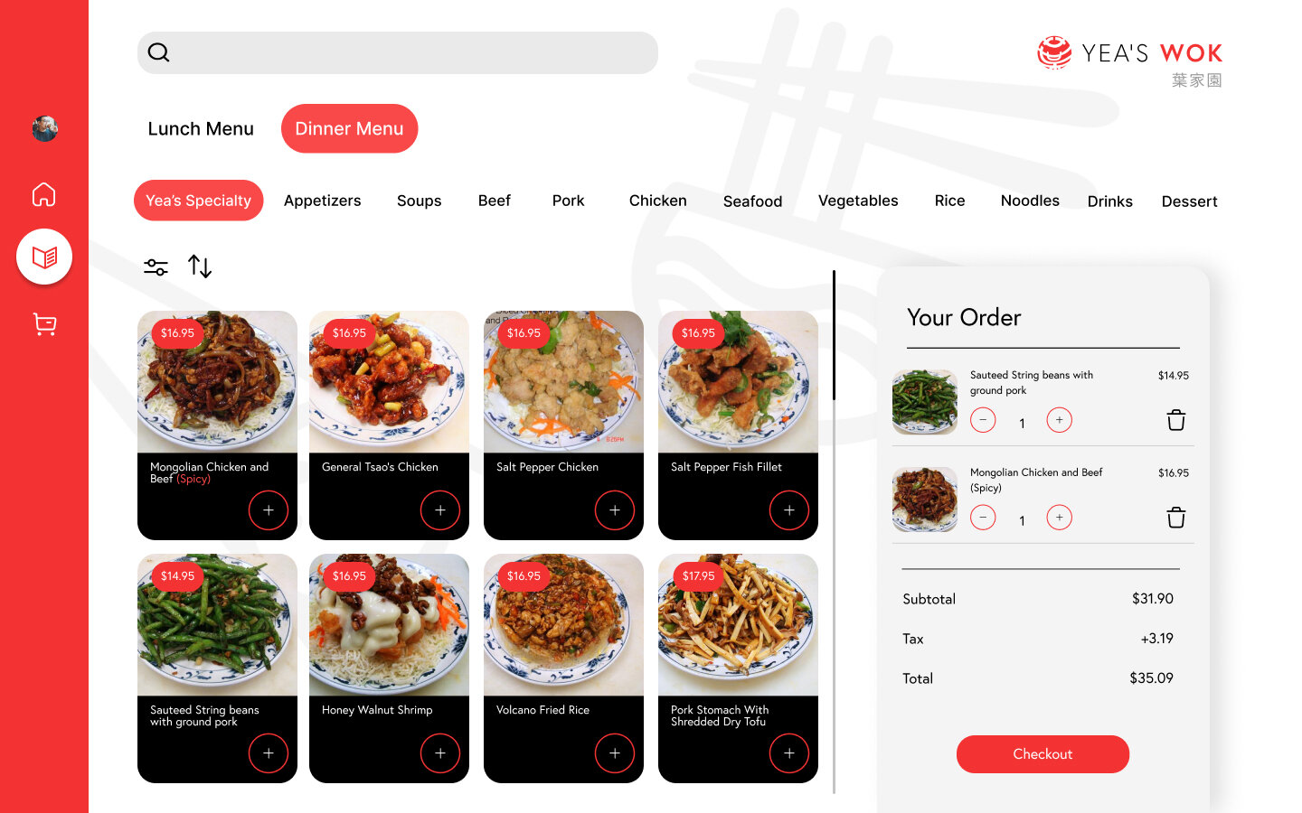
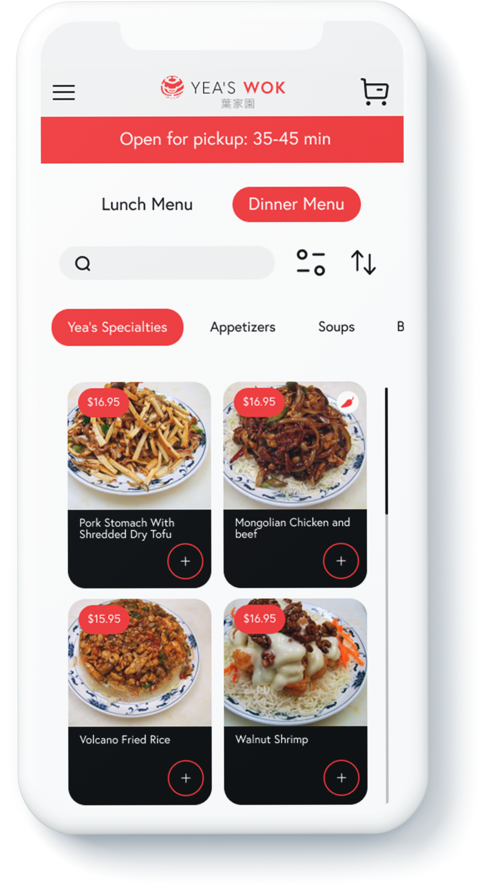
the competition.Many users during interviews felt they couldn’t find the item they wanted online. The current menu involved a lot of clicking for the user. I wanted the user to easily scroll through the options while categorized. (Similar to UberEats).
Wanted to make sure we made the site responsive to utilize the already limited screen space on mobile. Also to limit the need for users to zoom into the screen for accesibility purposes.

Revised Site
Revision Details
01
I researched design patterns with other food ordering apps to create a simmilar experience for users to make it easier for users to navigate the website. These design patterns also helped with utilizing the space used on the screen. Such as a hidden hamburger menu.
02
I wanted people to have a better menu navigating experience, so I took patterns from UberEats with the sliding menu, quick access to filters, and search bar that will automatically adjust the card menu system on the screen.
03
I wanted to address the problem of the amount of clicking a user had to do with the current site while navigating the menu. With the revised site, you can scroll through the entire menu easily. This way users can order their food as efficient as they can without having to wait on page loads.
Features

See the line
I wanted to be able to allow users to see how busy the kitchen is even before they order. Since they can’t see how busy a restaurant is in person giving a view of that
might help.

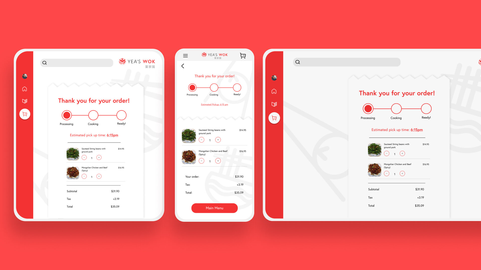
Track your order
The current site didn’t offer a way to track your order, but only offered pick up times. I wanted users to feel more confident as to where their order is and its status.

Past orders
Many users expressed difficulty ordering at Yea’s Wok as returning customers. They had to re-enter card information everytime, and finding menu items were difficult. I wanted to solve that by allowing users to re-order any past orders in one click.
UI
Design
As mentioned previously, Yea’s Wok didn’t have a very clear brand on their current site. I wanted to modernize the look while also taking cues from competitors so I knew how to make Yea’s Wok stand out. I also wanted users to know it was still the local family restaurant they loved.

Moodboard
Style Tile

UI Kit
Mobile
Prototype
Keeping the UI simple I went onto prototyping next where we saw the most changes. I conducted 1:1 interview prototype tests with current Yea’s Wok users and found some valuable insights.
View prototype
Iterations
Banner pick up time
During testing, many didn’t find the pop banner to be helpful or even knowing what number they were in the line. Many wanted to know more how long the wait for pick up would be and if the kitchen was still open. So I adjusted the banner to address this.

Pick up time + tips
Many users during testing found the checkout felt to abrupt and left them confused since there wasn’t an area to leave a tip. I adjusted this by creating a pick up time for orders and also a place to adjust payment and an option to add tip.

Selected Item
When selecting an item, you will also know what others have selected or what other dishes will pair well with this dish. Reviews are also available for each dish as well as a brief ingredient description of the item.

Track your order
On the current site, you weren’t able to track your orders. I wanted the users to feel confident in knowing the status of their orders even if there is a pick-up time. That way the restaurant also doesn’t need to call customers if they are running behind.

Checkout
At checkout I wanted to make the process easy, so on this page you can make any edits to your order or simply go back to look at more.
Final Thoughts
This project I was able to really understand the importance of exsisting design patterns and how to implement them as your own. Using current design patterns really helped with users being able to grasp and navigate through the website so quickly during testing. I found the most valuable insights during prototype testing in this project as it showed me a greater understanding on how users order their food from different types of users.
Next Steps
I would hope the client would want to implement these new changes to their website. I would love to do further testing on non-users to asl get an idea of how they feel about the prototype. I would also want to create the client’s side of this website to make sure both sides would integrate seamlessly and in turn create a better experience for both client and users.
YEA’S WOK RESPONSIVE DESIGN - 2021