Blankos Block Party: Enhancing game features, UI style, and branding for an elevated user experience and mature identity.
Project Overview
PROBLEM
Coming into an already-designed game is always a daunting task. With the game evolving so quickly, I was part of a small team to help design key new features to implement into Blankos Block Party (BBP) while also taking action to elevate our game’s UI style guide and overall branding to convey a more premium user experience for our players and for the brand.
OUTCOME
We successfully launched our key feature called “The Launchpad” to help players easily access essential features in the game that used to be too hidden within the architecture. We also created a more refined UI that lead to influencing the overall UI of the game to steer us in the new direction for it’s branding for a more mature audience, as well as adding motion into our design process to help guide our visual direction even further than before.
MY ROLE
UI Design, Motion Design, Illustrator
WORK OVERVIEW
UI Game design and motion design


Visual Refinement
Before creating any new screens for the new features, our lead tasked us to refine the UI. We studied the research provided by the UX Research team to guide us in a direction to be able to stand out in the sea of battle Royale games competitively. We found that going in a direction that felt more simplified and exuding a sense of premium quality was the best way we could stand out from our competitors according to the research.
Create more distinct, simplified design patterns throughout the game to allude more to the vinyl toy characters and vinyl toy packaging.
Adding in touches of subtle hand-drawn elements to bring back the “street” style from previous branding.
Introduced motion work to the UI to convey our ideas even better to engineers and enhance the overall user interface.
The launchpad feature itself included a breadth of other features that intertwined with one another. We had to approach this umbrella of a feature holistically to ensure consistency was met for all of the features within the Launchpad which included: The Launchpad platform, Grade Up Screen, Inventory screen, and the Skills screen.
We started looking at what the screens would look like together as players would navigate between these key features in the game.
We assigned colors to each of the areas to help players start to associate colors with certain features.
Designing the screens to be compatible and intuitive in both desktop and controller.
The Features
-

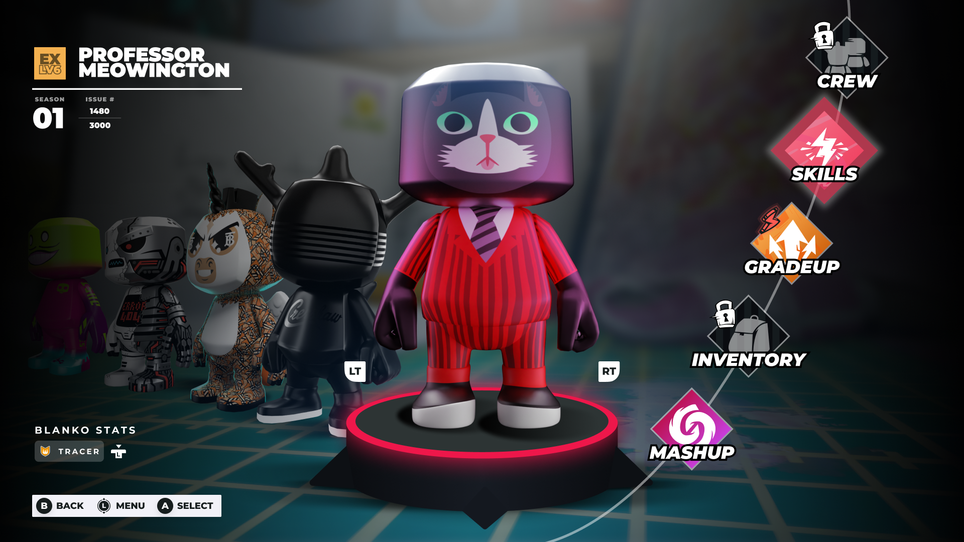
Launch Pad Platform
Bringing up essential features in the architecture to be more accessible to our players.
-

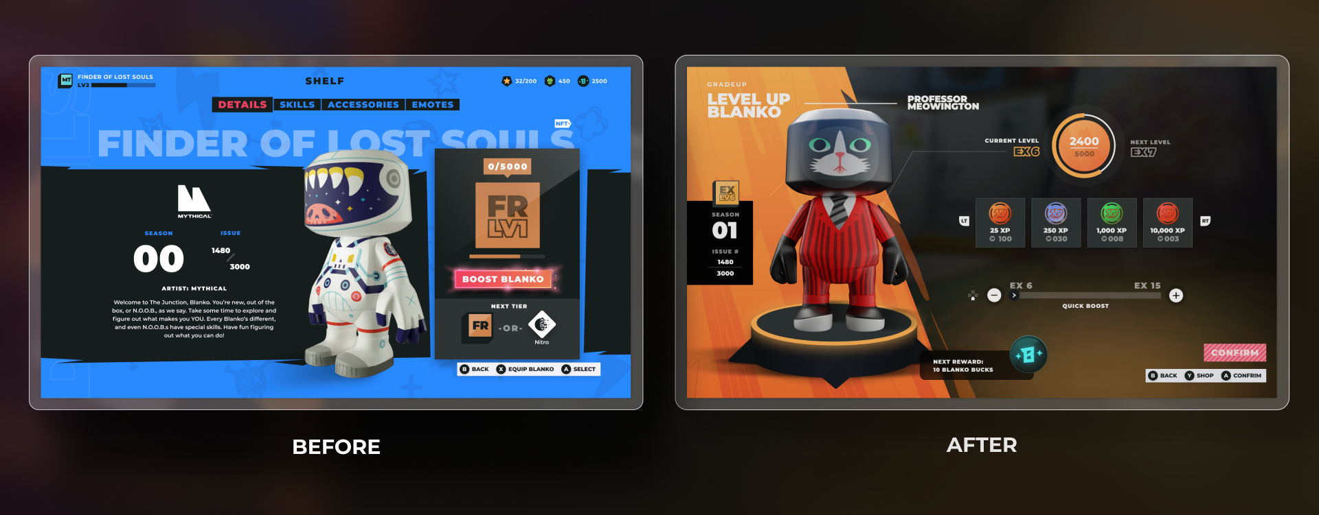
Grade Up Feature
Re-designing the Grade Up screens to better support players when leveling up their characters.
-

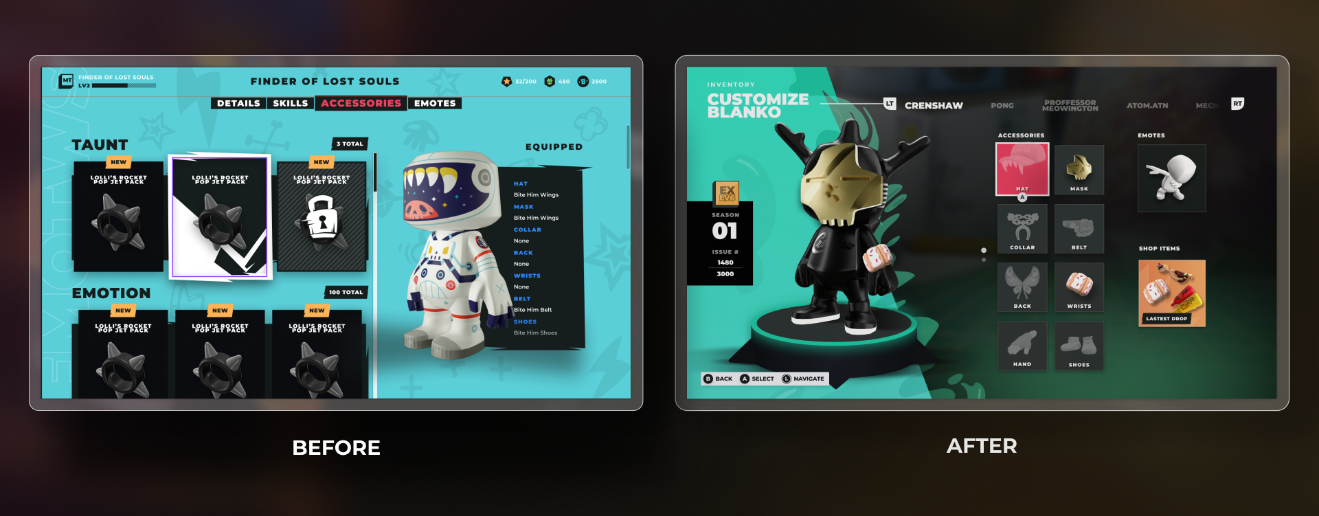
Inventory Feature
Re-designing the Inventory screens to a more intuitive user experience.
Launch Pad Platform
-
Creating the launchpad menu I worked closely with our UX designer to come up with way to execute this in the most holistic way possible as the launchpad menu would touch future features. Creating this, we had to think ahead of how the other screens would look like all together as players navigate to each of the menu options on the screen.
-
1. Navigate through pages efficiently so player can access essential pages to make changes to their blankos
2. See important information about their blanko (bring that up to the surface)
3. Make this menu accessible from the home screen.
-
We landed on the final design as it felt the most intuitive from a desktop and controller point of view but it also helped with future-proofing the menu by having the menu options go down the line instead of in a circle, we could add more pages into this menu without considering lack of space.
Grade Up Feature
-
Creating the grade up screen I worked with our senior UX designer and producer to figure out the main parts of this feature that we needed to implement into the screens. From game designers, we needed two ways to level up your Blanko
-
1. With specific XP chips that add up to a specific level you want to level up to. (This was a mobile pattern they had noticed in other games that they wanted to test out in Blankos)
2. A quick grade up which allowed you to level up quicker but not have the choice of which XP chips to use. (For those who wanted to level up quicker)
3. Make sure to show rewards to incentivize players to continue to level up their Blankos.
-
What I was solving for was creating a layout that could best show all the features needed while not overloading the players with information. The feature was pretty information-heavy heavy but I also wanted to use up the space provided on the screen instead of what we did have which was only using a portion of the screen. The old screen focused too heavily on the specific information on the Blanko rather than leveling the Blanko up. After a few layout iterations, I came up with two distinct designs:
1. (Current one) This is closer to what was seen within the UX with tweaks on layout and some added information.
2. Slightly thinking more outside the box and adding in pages to help separate out the information to avoid information overload for the user.
-
Ultimately after sharing with stakeholders, our goal was to implement this feature in the quickest way possible so that our players can level up their Blanko in a more efficient way than what we currently have. So we went with the option that was the most feasible with engineering and put the second option as something to work on in the future.
Inventory Feature
-
Worked with our senior UX and UI designer to design this heavy feature. We wanted to update the current inventory screen as it wasn’t intuitive in how we add accessories to a blanko. We also wanted a more stratifying moment for players to admire their accessories as they apply them to their blankos.
-
1. Designing this feature to allow players to visualize items / accessories they bought on their Blanko.
2. Designing this feature to help players add emotes to their characters easily.
3. Designing pages to incentivize players to buy more accessories .
4. Designing this page while also taking into consideration a lot of limitations that were based on characters and emotes.
-
1. Since accessories are NFTS we had to take into consideration also their mint numbers as important information 2. Some blankos had permanent accessories attached to them so how do we display that? 3, We needed to also include emotes 1. (Current one) This is closer to what was seen within the UX with tweaks on layout and some added information.
2. Slightly thinking more outside the box and adding in pages to help separate out the information to avoid information overload for the user.
Final Thoughts
Working on Blankos Block Party involved a lot of collaboration with so many different disciplines which truly shaped the outcome of all the work here. My biggest learning experience from working on this project was how to effectively work with engineers and what practices I can continue in my process moving forward.


